Published: Sep-2026 | Category: General
Collecting data is easy. Making it useful is the tricky part.
Before you pick up a sensor, start with one simple question: What am I actually trying to find out?
That question shapes everything that follows. It helps you decide what to measure, which sensor to use, how often to take a reading, how long to collect data and how best to present the results.
Get those first decisions right and it becomes much easier to spot patterns, investigate unusual results and reach a conclusion supported by evidence.
A useful scientific question tells you which variables matter and how they are related. For example:
How does the temperature of water change as it cools?
This question shows that temperature must be measured over time. It also suggests that a line graph will be helpful because the aim is to see how a measurement changes continuously.
Before collecting any readings, ask:
Once the question is clear, choose a sensor that suits the measurement. Check five things before you begin:
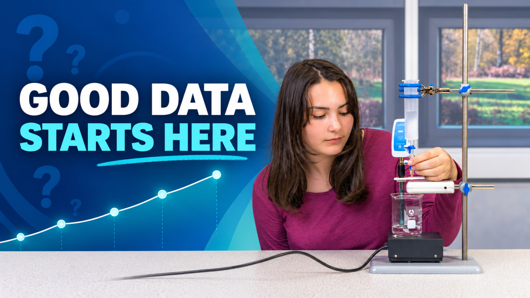
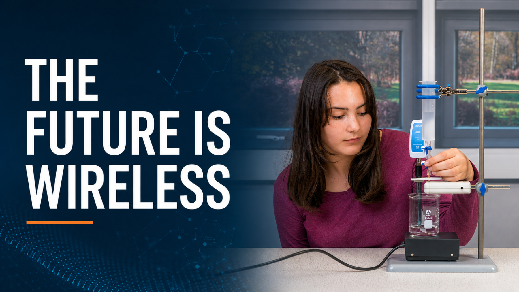
For cooling water, a Wireless Temperature Sensor should remain in a consistent position in the water throughout the investigation. Changing its depth or letting it touch the container could affect the measurements and make comparisons less reliable.
The best display depends on what you need to see. EasySense offers several ways to view data:
You can move between displays as the investigation develops. A number display may help while setting up the apparatus, while a graph may make the overall pattern much clearer once readings have been collected.
A number on its own is incomplete. A useful measurement needs a value and the correct unit, such as:
Data Harvest loggers report the units selected for the connected device. Take extra care to check the units when using calculated values or Snapshot data.
A graph is only useful if it matches the type of data being presented.
Use a bar chart when comparing separate groups or categories, such as the temperature measured in four different rooms.
Use a line graph when showing how a measurement changes continuously, such as the temperature of water as it cools. Time normally goes on the x-axis and the measured variable on the y-axis.
Whichever graph you choose, make it easy to understand:
A good scale uses the available space and makes meaningful differences visible. Large measurements might use intervals of 10, while smaller measurements might need intervals of 0.2.
You do not need complicated analysis to get started. Begin with straightforward questions:
For example, the temperature readings 18.2, 18.7, 19.1, 20.0 and 21.3 °C show an increasing trend. That is a useful first observation, but the next step is to consider why the increase happened and whether the evidence answers the original question.
Do not automatically remove a reading simply because it looks unusual. Check the apparatus, sensor position and conditions first. An unexpected result may be an error, but it may also reveal something worth exploring.
Simple statistics can make a set of measurements easier to describe:
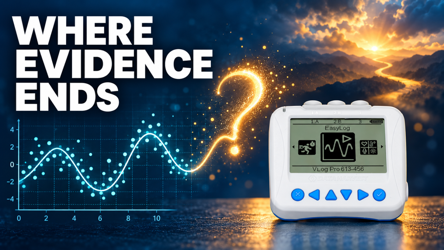
When two variables show a relationship, a Least Squares Fit can add a best-fit line to the data. This helps describe the overall trend, judge how closely the points follow it and make careful predictions within the measured range.
Before finishing, work through a quick check:
Question → Sensor → Data → Graph → Analysis → Conclusion
Good data does not begin with pressing record. It begins with a clear question and a sensible plan. Choose the right sensor, collect measurements consistently and present them in a way that makes the pattern easy to see.
Better measurements. Clearer data. Better conclusions.
The Data Presentation: Practical Advice guide provides a classroom-ready summary of choosing sensors and displays, using units, selecting graphs, setting scales and analysing results.
Take a look at the following articles from the same topic.