Published: Sep-2026 | Category: Secondary Science
A dripping tap can sound perfectly steady - until someone adjusts it. Traffic may arrive in clusters, even when the average flow appears consistent. How can we use recorded data to decide whether an event is regular, changing or genuinely unpredictable?
In this practical investigation, students mark each occurrence of a repeating event with a push button. EasySense records the event times, allowing them to look for patterns and use a line of best fit to compare regular and less regular sections of the data.
By completing the activity, students can:
A random count records how many times something happens when the exact result cannot be predicted in advance. Examples include the number of cars passing a point, calls received during an hour or wildlife sightings in a fixed area.
Individual events may be unpredictable, but a longer set of results can still contain useful patterns. Probability and statistics help us describe those patterns, compare different conditions and decide whether an apparent change is meaningful.
A dripping tap works particularly well because its rate can be kept steady and then deliberately changed. This creates sections that students can compare within the same recording.
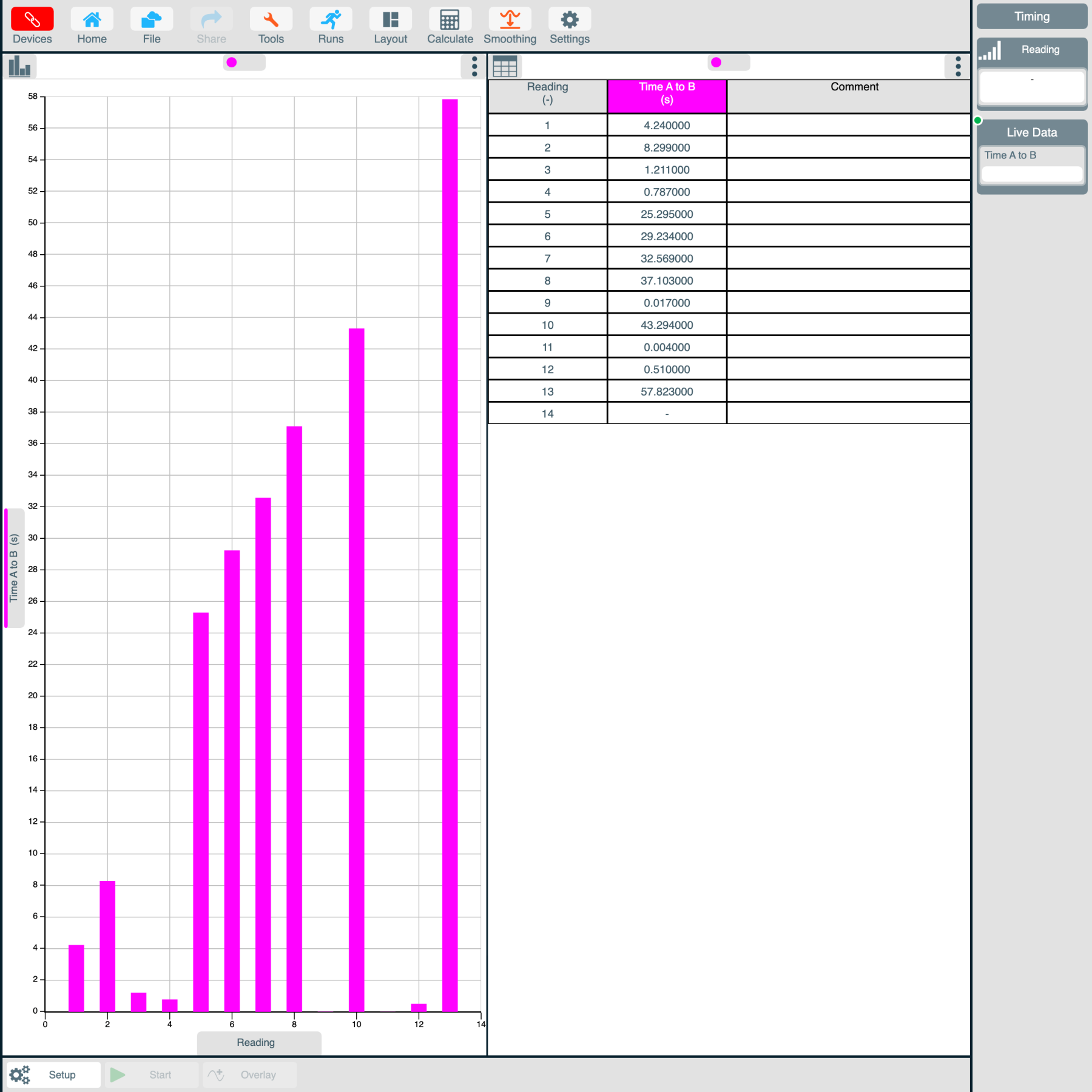
The reading number shows the order in which events occurred, while the event time shows when each one was recorded. If the gap between events stays constant, the plotted points should follow an approximately straight line.
The gradient of that line represents the time per event. For example, a gradient of 1 second per event indicates that one event occurred approximately every second.
If the intervals begin to vary, the points will move away from a straight-line pattern. A change in gradient may show that the event rate has changed, while a scattered or curved region suggests that the timing is less regular.
Select a section of the graph and apply the Best Fit tool in EasySense2. The R2 value describes how closely that selected data follows the fitted line:
In the worksheet example, the steady middle region gives an R2 value of 0.999 and a gradient of 1 second per event. When the fit is extended beyond this steady region, R2 falls to 0.834, showing that a single straight line describes the wider data less well.
It is important to be precise: a low R2 value does not by itself prove that an event is random. It shows that the selected results are not well described by that particular straight-line model. Repeating the investigation and collecting more events gives stronger evidence.
This activity gives students practical experience of:
Students could repeat the activity with traffic, pendulum passes or another observable event. They could compare different time periods, observers or conditions, or divide a longer recording into equal time intervals and count the events within each interval.
For older students, these counts can introduce probability distributions. The Poisson distribution may be considered when independent events occur at an approximately constant average rate, while the binomial distribution is useful for a fixed number of trials with two possible outcomes.
Repeated events often feel random when we experience them one at a time. By recording when they happen, graphing the results and testing how well a line fits the data, students can replace an impression with measurable evidence.
The complete worksheet includes the apparatus and EasySense2 setup, student method, discussion questions, example graphs and teacher and technician notes.
Take a look at the following articles from the same topic.